Colour trends never appear by chance. They reflect cultural shifts, evolving lifestyles, and changes in how we inhabit and experience our spaces.
Stepping into a room and instantly feeling calm, energised, or comforted doesn’t necessarily depend on expensive furnishings or complex design—it’s colour that creates the first emotional impression.
Colour has moved beyond being a purely decorative element; it has become a powerful tool for well-being. People are now looking for shades that keep pace with daily life—tones that can soothe when needed, spark creativity, boost energy, or enhance focus and rest.
The year 2026 promises to be one of bold chromatic contrasts in interior design, where serene neutrals coexist with vibrant, daring colours.
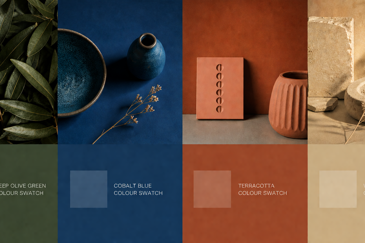
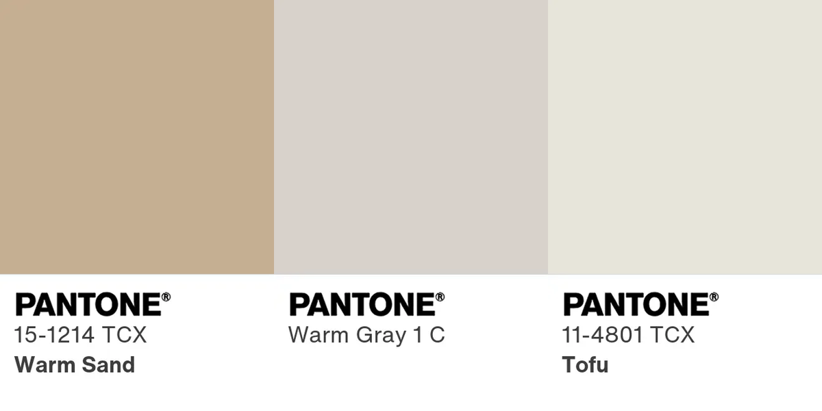
Neutrals That Set the Tone
- Warm sand, with a Mediterranean feel that replaces traditional beige.
- Soft stone grey, understated elegance that adapts to any interior.
- Linen-tinted off-white, brightens spaces naturally without feeling cold or sterile.
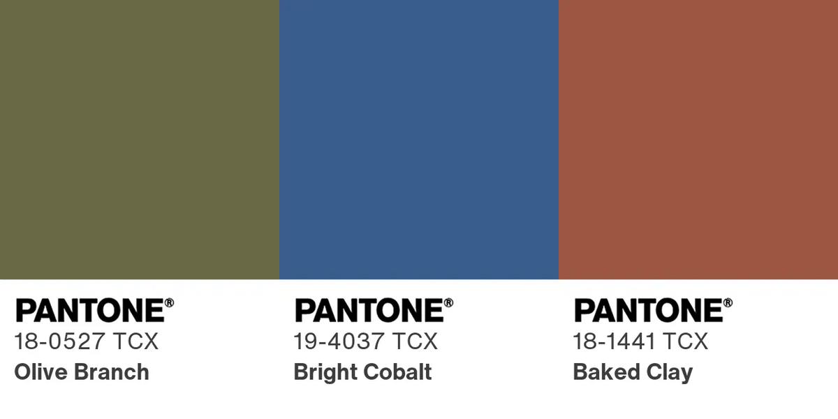
For those seeking something bolder, these richer tones will make a strong appearance:
- Deep olive green, earthy, grounding, and effortlessly connected to nature.
- Vibrant cobalt blue, perfect for modern statement pieces and contemporary interiors.
- Rich terracotta, which adds warmth and a distinctly Mediterranean energy.
How to Apply Colour Trends in Homes That Are Already Decorated
Integrating new colours isn’t about completely overhauling a home—it’s about balancing personal style with current aesthetic trends. The key is choosing shades that resonate with the homeowner’s personality while harmonising with existing elements.
It’s not about transforming the home completely, but about integrating new shades with intention. Cushions, lighting, rugs, and artwork allow the exploration of new colours in subtle ways. This approach is ideal for those who want to follow trends without altering the neutral base of their décor. Decorative objects also offer flexibility, making future changes easier and more affordable.
“A trending colour should converse with what is already there, not impose itself.”
Sometimes, all it takes is introducing a cooler in a small, intentional spot—like an entryway, guest bathroom, or an accent wall—to bring freshness without losing cohesion or character.
For example:
- Deep olive green, works beautifully on a living room wall or as sofa upholstery.
- Cobalt blue, shines in smaller statement pieces, such as an armchair, artwork, curtains, or ceramics.
- Terracotta, adds warmth to kitchens, reading nooks, or dining areas, and can even be applied to flooring or wall finishes.
Ultimately, colour is a conversation: neutrals form the timeless canvas, while intense tones act as notes of personality that transform the atmosphere.