

North-facing rooms can be some of the most challenging spaces to decorate. With limited direct sunlight throughout the day, they often feel cooler and darker than other areas of the home. Northern light naturally enhances the cooler undertones within a colour, which means that pale shades with blue or grey bases can sometimes appear even colder than expected.
When designing a north-facing room, the key is to choose colours that counterbalance this cool light and introduce a sense of warmth. Rich, earthy hues and shades with warm undertones help create a welcoming atmosphere, bringing depth, comfort and character to the space.
The good news is that many of the leading colour trends for 2026 are perfectly suited to these conditions. Warm neutrals, sophisticated terracottas, soft clay tones and cocooning reds all work beautifully in north-facing interiors, helping to create a balanced and harmonious scheme even in the coolest natural light.
What colours work best in a north-facing room?
In a north-facing room, I usually begin with warm whites, beige, clay and earthy red tones. These colours help offset the cooler natural light without making the room feel artificially bright.
Blue and green are not off limits, but I prefer shades with enough depth to feel intentional. Darker colours can work particularly well on cabinetry, joinery or throughout a smaller room where a more cocooning effect is appropriate.
The palettes below include lighter foundations and stronger accent colours. You do not need to use every shade across four walls. A deeper colour can be introduced through a feature wall, painted furniture or woodwork.
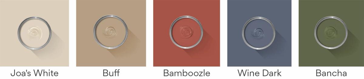
Farrow & Ball colours for north-facing rooms
Joa’s White and Buff provide two warm, quieter foundations. Bamboozle introduces a stronger terracotta red, while Wine Dark and Bancha offer deeper blue and olive-green alternatives. These richer colours can work well when the aim is to embrace the room’s lower light rather than fight it.
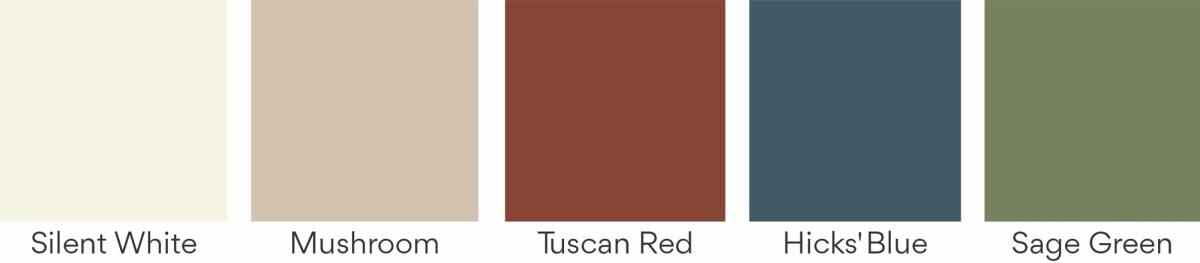
Little Greene colours for north-facing rooms
Silent White and Mushroom are the softer neutral options in this palette. Tuscan Red brings warmth and character, while Hicks’ Blue and Sage Green create a more enveloping result. The deeper shades would also work well on cabinetry or joinery against a warmer neutral wall.
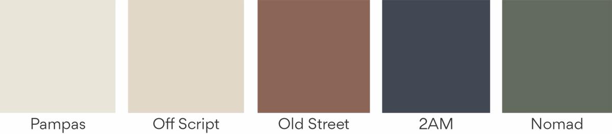
COAT colours for north-facing rooms
Pampas and Off Script form a warm, understated base. Old Street adds an earthy reddish-brown, while 2AM and Nomad introduce deep blue and muted green. These shades could be used individually or repeated through paint, upholstery and accessories to connect the room.
Test paint colours in the room
Paint can look very different in northern light than it does on a screen or colour card. Test each option on a large sample board and move it around the room. Check it in the morning, afternoon and under the lighting you use at night.
View the sample beside the flooring, curtains and largest pieces of furniture. A colour that looks warm on its own may read differently next to a cool grey sofa or a blue-toned floor.
If you are considering a wider update, my guide to 2026 interior colour trends explains how these warmer neutrals and stronger shades can work within an existing scheme.